
Before I begin on the above-mentioned topic, I must share a forthcoming book that caught my eye on the ALA Exhibit floor. It made such an impression, I went back to savor the f & g’s (folded and gathered unbound page signatures, in publisher parlance), page-by-page, at three separate intervals.
 It’s all in the eyes. They are wide-open and clearly shaped. And I love how those large eyes complement and balance the graphic shapes in all of Christian Robinson‘s illustrations.
He makes his picture book debut in Harlem’s Little Blackbird: The Story of Florence Mills (October 2012 from Random House).
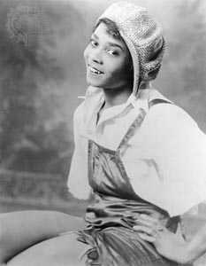
Florence Mills was a celebrated African-American jazz singer, dancer and comedian (1896-1927). A major figure of the Harlem Renaissance, she was known for her stage presence and wide-eyed beauty. Her talents were immortalized via songs by Duke Ellington and Fats Waller. 
During her short life, she became a sensation in America and Europe, and beloved in Harlem. No recordings exist of her voice, only descriptions: “. . . like a hummingbird”, “. . . full of bubbling, bell-like, bird-like tones”, “. . . a tempestuous blend of passion and humour”, “. . . strange high noises”, “. . . an enraptured bird.” A fine dancer as well, some attribute her reluctance to make recordings to her strong preference for interacting directly with her live audience. Given it was the age before microphones, recording devices were rudimentary.
But back to Christian Robinson‘s work on Harlem’s Little Blackbird: I think an illustrator must pay special attention to the way they render eyes.
Eyes. It’s the first feature my own eyes rivet to, when perusing any illustration, so it helps when eye treatment is distinctive . . . plus they must echo other shapes that appear within the rest of the graphic composition. The result is memorable.

Title page illustration

Florence Mills was part of the Harlem Renaissance, which included Duke Ellington, Langston Hughes, Fats Waller, and Eubie Blake. [click to enlarge]

Florence Mills loved interacting with her audience [click to enlarge]

Mills was also a terrific dancer [click to enlarge]
A tangental note to my ART 40011 Class Alumni & Friends: It’s all about the right combination of shapes, sizes, repetition, and contrast plus judicial use of white space. Think Molly Bang. . .

“…Contrast enables us to see…the contrast can be between colors, shapes, sizes, placement or combinations of these….Pictures — and human perceptions — are based on contrasts.” — Molly Bang, PICTURE THIS: How Pictures Work / Illustration © 1992 Molly Bang
______________________
. . . which leads me to the subject of Portfolios.
What do Art Directors and Agents look for in a children’s book illustration portfolio?
Let’s look at a sampling from Christian Robinson‘s on-line portfolio:

[click to enlarge]
And I mean full head-to-toe folks of all types, ethnicities, sizes, shapes, and ages. No cropping! Body language is of utmost importance in children’s books, not to mention graphic novels and wordless picture books.
They should be DOING things, not posing (unless they are part of the same army, as below), as if we captured an action shot without being noticed.

[click to enlarge]
Put your characters in situations where they are doing everyday activities. Capture an action moment that tells a story.

[click to enlarge]
Here is a commuter scene (above). Each person is drawn as a unique personality. Our eyes are drawn to the mother with gesticulating hands (they speak!) and her small child gazing back at her. Eye contact between subjects. Grouped people, seated on a bus. There’s a sense of place. Perfect!

[click to enlarge]
It’s good to have one close-up or head shot. But no more, unless you are strictly a portraitist.
Make sure to include black and white illustrations . . . .

Black and white illustrations by Christian Robinson from Queer: The Ultimate LGBT Guide for Teens, © 2011 Zest Books [click to enlarge]

[click to enlarge]
Check out the hands placement; the girl’s wistful smile; and the bird gazing at the girl. But the girl is not looking at the bird, but far far away. It’s a story!

“Cookies, please!” [click to enlarge]
![[click to enlarge]](https://gotstorycountdown.files.wordpress.com/2012/07/rain14-15.jpg "rain14-15") The feeling of a neighborhood, with repetition of characters from another art piece (the mother and child from the “Cookies please” illustration).
The feeling of a neighborhood, with repetition of characters from another art piece (the mother and child from the “Cookies please” illustration).
Note how the people vary in size, from piece-to-piece.

You could fill a boat with an assortment of people… [click to enlarge]

Place people in vehicles, on animals, in another country…and add trees [click to enlarge]

Ooodles of poodles plus one… [click to enlarge]
Make every picture tell a story. Note that Christian has dogs in his portfolio too (above).

How about a world-renown landmark plus an airplane. . . [click to enlarge]

And some tall buildings . . . [click to enlarge]

. . . plus Josephine Baker with her leopard, Chiquita [click to enlarge]
Check out Christian Robinson’s blog here
______________
Thinking about portfolio content brings to mind the role of postcards.
Should an illustrator create postcards of their work?
I’d say absolutely. Every art director I’ve encountered still pins their favorites over their desks for future reference. They could love your work, but don’t have the right project at the moment. But they’ve indicated they will keep you in mind.
Could they be using Pinterest? Maybe! It’s good business sense to have e-versions of such cards, with direct links to your website/blog and email. And as part of your email signatory. But I digress. . .
I’m not talking about sending hundreds of postcards blindly to a large mailing list culled from the SCBWI directory, addressed to “Art Director” or “Editorial Dept.” This is a huge waste of time, resources, and paper, destined for the land fill.
Postcards make the perfect “ticklers”, or reminder when directed to the right person.
Or as follow-up thank yous to art directors or agents for their feedback.
At the ALA, I was delighted to come across the following series of postcards (at the Simon & Schuster booth) Marc Rosenthal created as promotionals for his newest release, I’ll Save You, Bobo, the sequel to the popular I Must Have Bobo.
They work as (a) reminders of the previous Bobo; (b) fun images to hang onto a bulletin board (keepers for clients & fans) ; (c) a clever series of sequential mailings; (d) hand-outs at book fairs and conventions.
Here’s the address side:

Here are the five variations of the reverse side:


Reblogged this on got story countdown and commented:
On the eve of SCBWI-San Diego’s E.B. Lewis get-together, I thought it would be timely to re-post this tickler of tips. It’s dedicated to those of you who may be sharing portfolios there — or somewhere else out there! Cheers! — Joy
Pingback: Writing Diversely: LGBTQAI Characters | OK POTATO
Pingback: Hot Tip | got story countdown
thanks for the great advice and examples. I’m just starting to develop my children’s portfolio and it is all very new to me. i’ve done some local commissioned illustrations, but never knew about all the considerations that children’s illustration entail (even though i’ve been saying since i was little that i want to illustrate children’s books one day!) i have one question, should a physical portfolio include titles, media, dimensions of the work? I’m having my first children’s illustration portfolio review next week. i know my portfolio is far from ideal, but i figured i could get help in figuring out what direction to take it. also, do pictures of nature and landscapes work for children’s illustration? unfortunately, my portfolio is really lacking on human/child figures, but i have lots of nature and animal-oriented work. thanks!
Thanks, Annalisa. Cheers!
Lovely illustrations.
Thank you, Lori! 🙂
Great examples. I love the mom and child on the bus!
Thanks for the helpful information.
Thanks, Denise! Great seeing you at Saturday’s SCBWI gathering!
Excellent information, Joy, as always! Great advice and reminders and I especially enjoyed the vignette on Florence Mills and the pictures included. A good tie-in to show how the illustrator really captured her essence.
Thank you for the shout-out, and kind words on the Got Story? Facebook page too, Bridget! Cheers!
Yes, yes, yes! You said it all Joy. Thanks for a great post and for introducing us to the lovely work of Christian Robinson!